
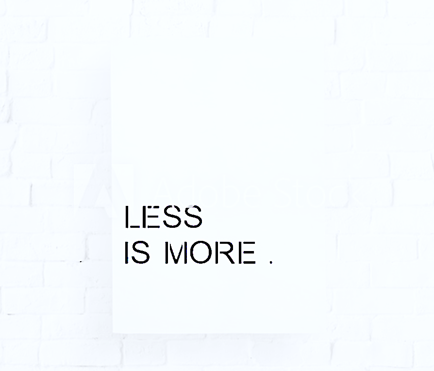
Less is more aka the value of quality in design, communication and perception |
Ever thought of the pure value of a meaningful dialogue, a conversation that makes sense by contributing with an “aha” moment in its’ written, oral or pictorial form? The essential moment of discovery, the tiny second of perceiving the core element of a message |
A few centuries ago, this Scottish philosophical adventurer stated
we live in a world where there is more and more information, and less and less meaning | David Hume
In those simple few words
an eternal truth is cleverly hidden …
it is all about the quality,
the conscious selection process
and
the eagerness to find out more about
a particular subject…
being selfishly selective
leads our mind towards finding more
about subjects close to one’s heart, mind and soul |
How do the above statements relate to design and communication? Well, simply said, there is a close connection between being mindfully demanding {READ: selective} and the moment of discovering the uncompromised quality… that largely contributes to something that can be described as rather fine |
What are the reasons for paying so much attention to the quality of design and visual communication?
Something that represents a real value, something that signifies the organisational credo or represents the mission of a business… well, no further arguments needs… it must be not just “pretty” or “good”, it must be outstanding, it must signifies the reputational advantage of a business in order to be treated with a deserved respect while contributing to long-term successes achieved by high quality communication messages, assets and engagements |
The know-how of quality in design:
1 | does it serve the purpose?
2 | is it easy to understand?
3 | is it aesthetically pleasant?
4 | does it speak the language of your audience?
5 | is it authentic?
6 | will it remain current?
7 | can it be used in multicultural environments?
8 | is it balanced?
9 | is it eye catching?
10 | does it evoke harmony and balance?
Thoughts’ take-aways
Visual communication professionals, brand managers, graphic designers to ensure the quality is strongly associated to the pieces signed by their name shall put a significant amount of review/audit work into their work to discover whether it creates a desirable impact on potential viewers and be prepare to make constant adjustments |
The key ingredient for producing a high quality piece of communication whether it is in its musical, graphical/visual or written form …. A constant focus appears to be the prerequisite of a success. Checking the quality, the balance and an overall harmony shall remain the epiphany of any visual communication designer who aspires to create something that is pleasing, appreciated, balanced and … for some can be perceived as simply perfect |
Communication is an art…
It does not need to be perfect, it needs to be symmetrical, aspiring to create flawless outcomes and engaging | Dr A A Drzewiecka
Need advice on assessing your organisation’s communication flow? wishing to get more clienst onboard but do not know what appraoches to use? Get in touch { herehere }